ZEISS - Beyond Design System
Client:
Carl Zeiss AG
Industry:
Optics & Medical Technology
The Beyond for Online Design System is ZEISS's unified design language for their digital platforms — public websites, customer portals, and e-commerce experiences across the optics and medical technology space.
I developed and maintained the system's Foundation library and the Component library in Figma, conducted usability research with Maze that directly influenced the product roadmap, and built a standardised research practice — including templates, reporting frameworks, and onboarding guides — that enabled the team to run studies independently.
This case study covers the design system architecture, a usability study on the DCC Portal, and the research infrastructure I built to make the team self-sufficient.
Why this work mattered
ZEISS makes some of the world's best optics — microscopes, lenses, medical devices. They've been at it since 1846. But their digital products were a different story. The websites, customer portals, and e-commerce platforms had grown organically over the years, and they looked like it. Different teams were making different design decisions, and the inconsistency was starting to show.
The Beyond for Online Design System existed as a foundation, but it needed someone to expand it, validate it, and make sure people actually used it. That's where I came in.
My role wasn't just "design components"
I was the UX/UI Designer on the team, but my actual work broke down into four areas that were quite different from each other:
I built and maintained UI components in Figma. I ran usability studies using Maze to test whether our designs actually worked. I wrote research reports that went to senior stakeholders. And I created the templates and guides that let other people on the team do research without me.
That last one turned out to be the most valuable thing I did. But first, the design system itself.
Getting the basics right
Like most design systems, ours needed to cover all the basics — colour, typography, spacing, grid, corner radius, shadows, blur, motion, icons, illustrations and a comprehensive component library. The difference was in the details.
I've seen design systems where the colour tokens are so abstract that nobody can figure out which one to use. Or where the components look fine in isolation but fall apart the moment you put them on an actual page. I wanted to avoid both of these problems.

A colour system you can actually understand

Colour systems have a tendency to get overly complicated. I've worked with systems where there are hundreds of tokens and nobody remembers what half of them do.
For Beyond, we used a semantic naming convention: global/component – element – state/options. So if a colour token starts with "chip," you know it's only for chip components. If it starts with "global," it works everywhere. The name tells you where to use it.
We also set up Figma variables to handle light and dark themes automatically. The same token name maps to different values depending on the theme, so switching between light and dark mode doesn't require any manual work.
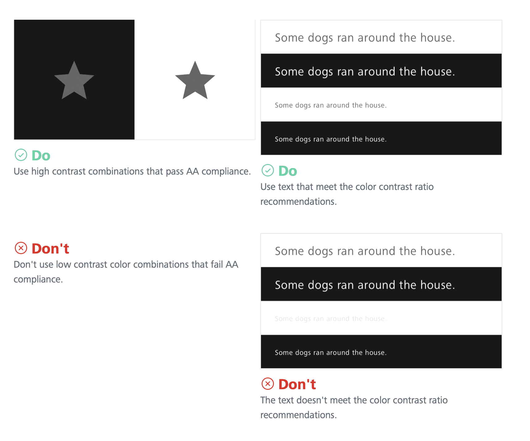
I made sure all colour combinations were WCAG 2.1 AA compliant. The contrast ratios came out at 17.98:1 for highlight colours and 11.24:1 for secondary levels — well above the minimum requirements.
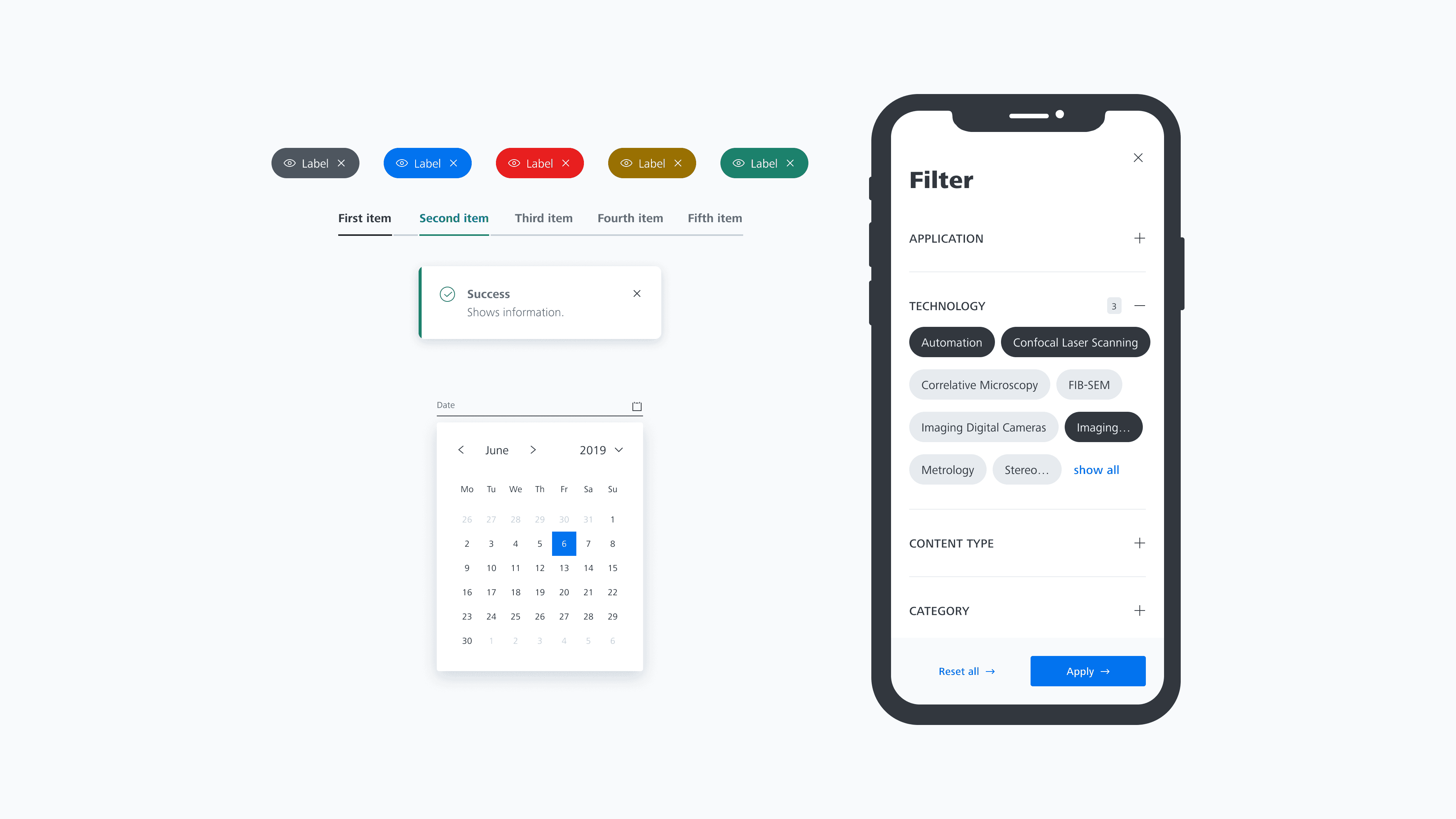
80+ components, organised so you can find them
The component library grew to 80+ components across seven categories: Base (5), Actions (7), Form (14), Navigation (14), Content & Data (16), Search & Filters (4), Loading & Status (3), and Feedback (6).
One thing that bothered me about other design systems was how fiddly the components were to use. You'd drag one onto the canvas and then spend five minutes trying to figure out how to customise it. I added clear properties to each component so you could change things like size, state, and content quickly, without digging through layers.
I also tested every component by placing it inside real page layouts. It's easy to design a beautiful button in isolation. It's much harder to make sure that button works alongside a form input, inside a modal, on a mobile breakpoint, with an error state visible. That's where the real work happens.
Each component was published with live Storybook demos on Chromatic, and documented on Frontify with Do/Don't guidelines, anatomy breakdowns, and responsive specs.

Versioning, because things change
Everything followed semantic versioning — major.minor.patch. Version 2.1.3 means major version 2, minor update 1, patch level 3. The versioning applied to the library as a whole, not to individual components, which kept things manageable.
We maintained a changelog and had defined communication channels so designers and developers knew when something changed. It sounds basic, but I've seen teams ship breaking changes without telling anyone. That erodes trust fast.

Accessibility wasn't an afterthought
I contributed to a dedicated accessibility Figma file that served as a one-stop shop for designers. It included a comprehensive checklist covering everything from time-based media to interactive elements to input fields — plus eight more categories.
There was also a "How to get started" onboarding guide, core rules referencing WCAG 2.2 AA and the European Accessibility Act, and developer handover checklists for both general and component-specific specs.
The idea was simple: if you're using the Beyond design libraries, you're already set up for success on colour contrast. But the library alone can't handle things like layout hierarchy and content creation. Those need the designer to think about accessibility from the start.
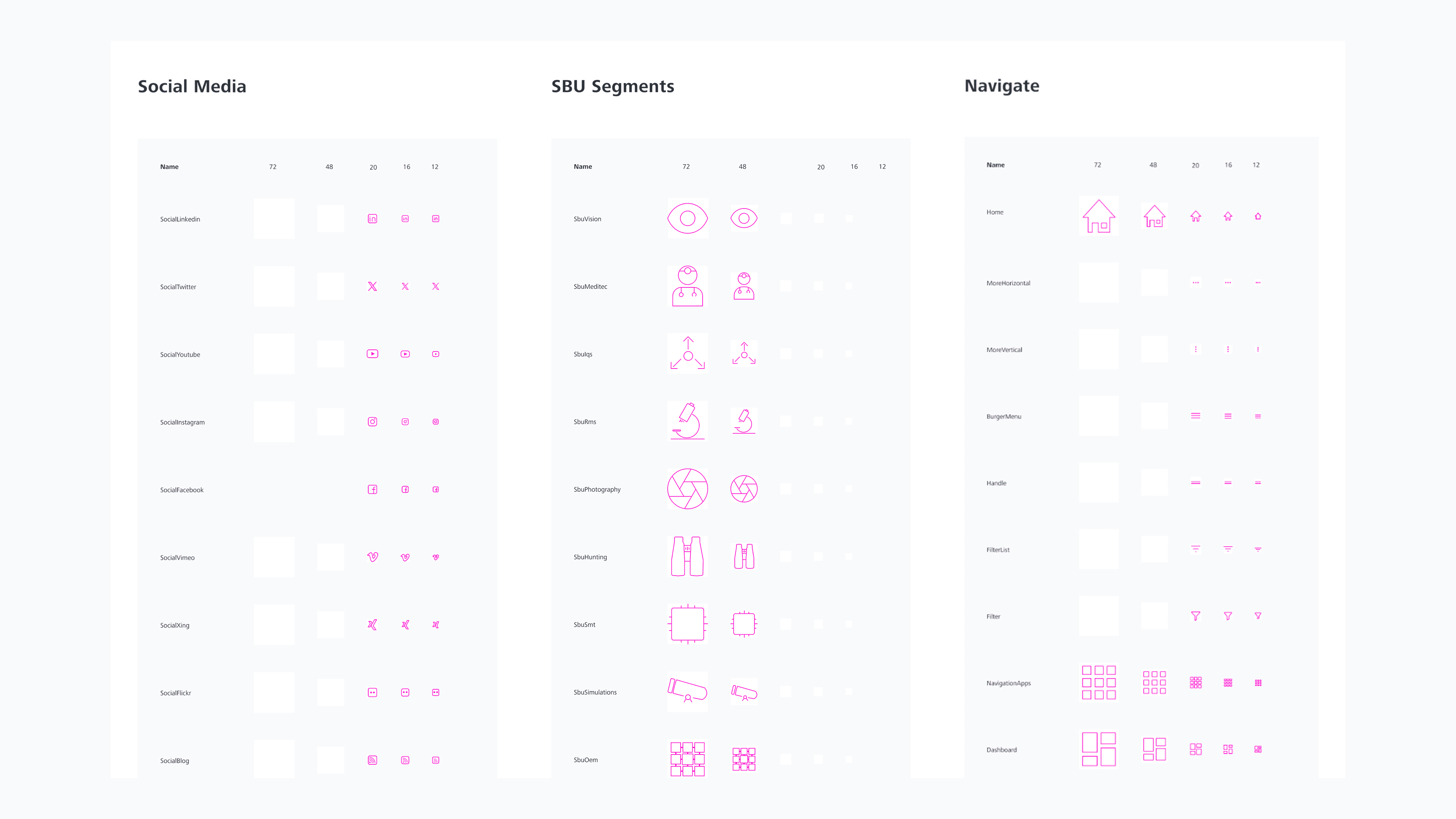
137+ icons and a system for making more
The icon library grew to 137+ icons, each following consistent sizing and style guidelines. More importantly, we built a creation workflow so new icons could be added without breaking the visual consistency. There was also a backlog system where teams could request icons they needed.
The research that actually changed things
Now for the part I mentioned at the beginning — the work that mattered most.
I ran Maze testing on the UI Shell — the persistent navigation framework (header, sidebar, footer, burger menu) that sits underneath all ZEISS digital products.
The question was simple: can users find the website name, the navigation items, and the primary and secondary utilities when the components are in different states and edge cases?
This project followed the full design process — research, workshop, exploration of three side-navigation variants, user testing with three scenarios, analysis across twenty dimensions, developer handover specs, and a stakeholder presentation. It was a lot of work, but the navigation is the skeleton that everything else hangs on. Getting it wrong would affect every product.

Building a research practice, not just running studies
This was the part I'm most proud of.
When I joined, every Maze study was set up from scratch. There were no templates, no shared methodology, and no documentation for new team members. If I left, the research capability would leave with me.
So I built the infrastructure to make it self-sustaining.
A template decision framework — I created a decision tree mapping 14 test templates across four categories. If you're testing a new design, you'd pick from category A (surveys, prototype tests, variant tests, 5-second tests). If you're testing navigation, category B (card sorting, tree tests). If you want feedback on a live design, category C. And category D for mixed methods.
A standardised report template — so every study produced consistent, actionable output regardless of who ran it.
A Maze onboarding guide — walking new team members through everything from account setup to launching their first study.
The result: study setup time dropped from about two hours to thirty minutes. New team members could run their first study independently within their first week. The research practice outlived my time on the team, which is exactly what I wanted.

What I learned
Two things stuck with me from this project.
Systems thinking matters more than pixel pushing. The Maze templates and research reports drove design system adoption more than any component I designed. When the team had evidence that their design decisions worked, they trusted the system. That's what adoption really comes from — not documentation, but confidence.
Test earlier, not just at the end. The DCC homepage confusion could have been caught during wireframing if we'd tested then. By the time we caught it, the page was already built. Testing is most valuable when it's cheapest to act on the results.
I hope this gives some insight into the work behind the Beyond Design System at ZEISS. The component library was important, but the research and process work is what I think about most when I look back on this project. Building things that last after you leave — that's the real test of good design work.
